Color Coordination Tricks For Effortless Styling
Color is one of fashion’s most powerful tools — it can transform an ordinary outfit into something truly remarkable. Whether it’s a pop of bold red, a subtle pastel, or a soothing neutral palette, mastering the art of color coordination allows you to express personality, confidence, and creativity effortlessly. With the right balance of hues, tones, and contrasts, even the simplest pieces in your wardrobe can stand out beautifully. Let’s explore some timeless color coordination tricks that help you style smarter and look stunning every time.
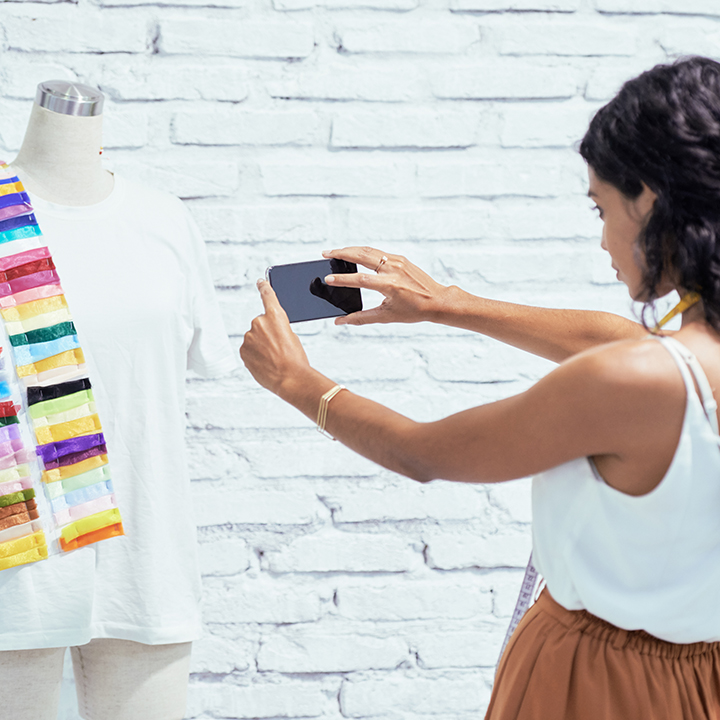
Color Wheel
Before experimenting with shades, it’s helpful to understand how the color wheel works. Colors positioned opposite each other — like blue and orange or red and green — create vibrant contrasts known as complementary pairs. These combinations bring out each other’s intensity and energy. On the other hand, analogous colors, which sit next to each other on the wheel (like blue, teal, and green), create a harmonious and soothing effect. Knowing this basic principle helps you mix and match clothes with confidence and purpose.
Choose Neutrals
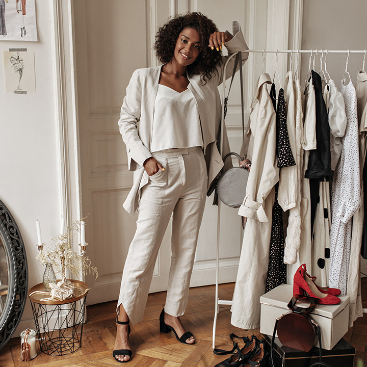
Neutral colors are your best friends when building versatile outfits. Shades like white, beige, black, gray, and navy can effortlessly balance bolder tones. For example, pairing a bright top with beige trousers or a black jacket with a pastel dress helps create a polished, sophisticated look. Neutrals also serve as the perfect foundation to highlight statement accessories or footwear. Think of them as the calm backdrop that allows your chosen color to shine.
Color Family
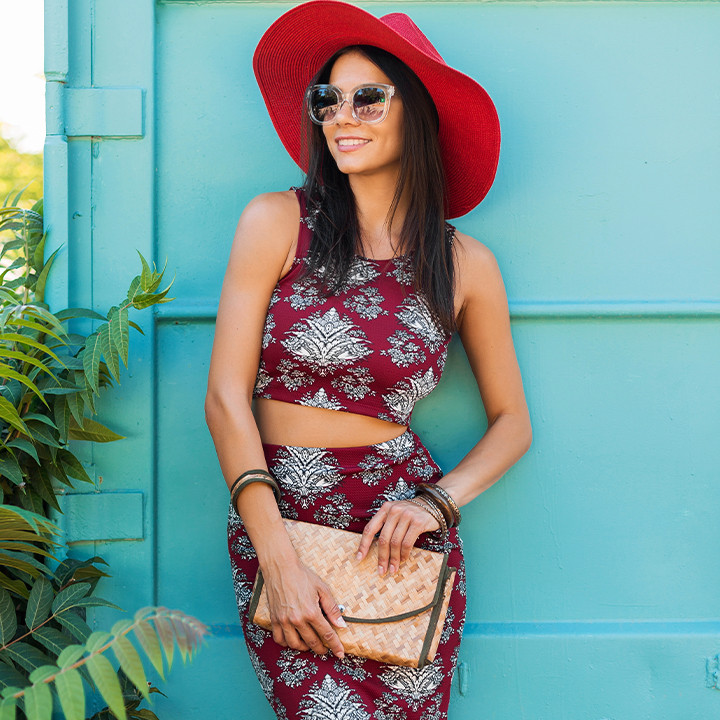
When in doubt, dressing in similar shades from the same color family is an easy way to stay stylish. Monochrome dressing — wearing variations of the same hue — creates a sleek, elongated silhouette. You could try a combination like sky blue with navy, or cream with sand beige, to achieve a refined and balanced look. It’s elegant, effortless, and always fashion-forward.
Balance Tones
Warm colors (reds, yellows, oranges) radiate energy, while cool tones (blues, greens, purples) evoke calmness. Pairing them thoughtfully creates visual balance. For instance, a warm terracotta top with cool-toned denim looks naturally cohesive. This contrast ensures your outfit never feels flat and adds depth without overwhelming the eyes. When mixing warm and cool hues, keep accessories neutral to tie the look together seamlessly.
Don’t Overcomplicate
Effortless styling thrives on simplicity. Limit your outfit to two or three key colors to avoid clashing combinations. If you’re wearing a vibrant print, let it take center stage and tone down the rest of your look with subtle shades. Sometimes, minimal color coordination creates the strongest impact — because less is often more when it comes to chic styling.
Final Thoughts
Effortless color coordination is less about rules and more about balance, intuition, and confidence. Once you understand which shades complement each other and reflect your personality, styling becomes second nature. Remember, the best color palette is the one that makes you feel comfortable and empowered. So, explore, mix, and make your own combinations — because great style starts with bold choices and ends with self-expression.